Ratio Chart - Banknifty v/s NiftyRatio chart is at an important support zone suggesting bank nifty to lead nifty from now.
Search in ideas for "RATIO CHART"

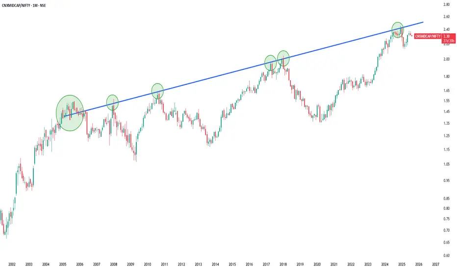
Ratio chart of Nifty Midcap/Nifty in Monthly Time FrameThis is Ratio chart of Nifty Midcap/Nifty in Monthly Time Frame . Indicates in bigger time frame Midcap Under perform Nifty50 .
$SMH vs $HACK Ratio Chart: Intra Tech sector rotation NASDAQ:SMH with closing @ 180 $ on 04 April 2025 is equivalent to drawdown we saw during COVID crash. During the covid crash the semiconductor ETF lost 37% and this tariff crash we also saw 36% drawdown. But in contrast to that the current tariff environment has only a peak drawdown of 25% in $HACK. AMEX:HACK is the ETF of the largest Cybersecurity in the market. Within the Technological sector there is a intra sector rotation form Semi and Software to Cybersecurity.
This weakness in NASDAQ:SMH can be attributed to heavy weights like NASDAQ:NVDA and NASDAQ:AVGO which have been down more than 40% form their ATH. But in contrast NASDAQ:CRWD , NASDAQ:PANW and other cybersecurity stocks have shown great amount of strength.
In this ratio chart we discussed earlier in this blog that there is a head and shoulder pattern forming indicated in the blue but then the drawdown in SMH pushed it below the neckline and we went below 3.15. The next level in the ratio chart is 2.71 to which we are very close. From the peak the ratio is down almost 40% which is the same as the drawdown in $SMH. The RSI in the chart is also oversold @ 28. My expectation the second neckline will not be broken, and we will hold the 2.7 ratio.
Verdict: Overweight NASDAQ:SMH over $HACK. Both are good long-term buys.

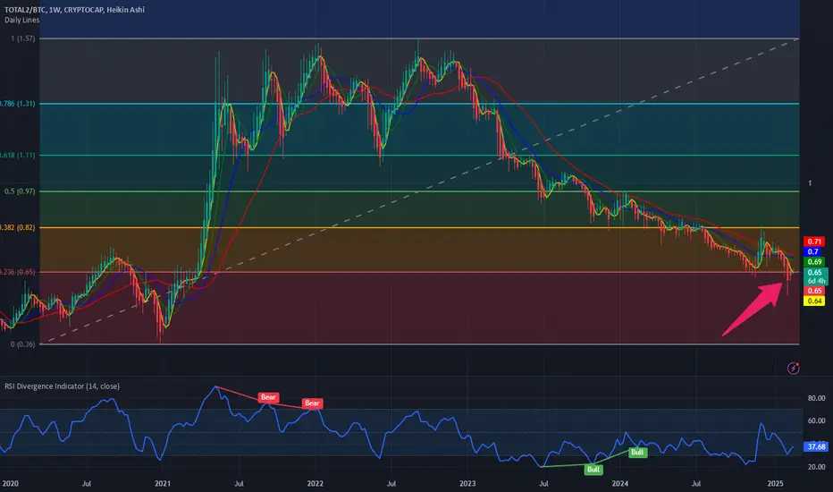
New ratio chart: $TOTAL2/$BTCToday we are looking at a new ratio chart where we plot the CRYPTOCAP:TOTAL2 (Crypto market cap without Bitcoin) vs CRYPTOCAP:BTC market cap. As we see from the chart the ratio chart as we see is making lower lows and lower highs. ALTCOINS are bleeding against the CRYPTOCAP:BTC in this Crypto market cycle. The long-awaited ALTCOIN rally is still missing in this crypto market cycle.
With TVC:US10Y holding onto the 4.5% level there is very little respite from the pressure on the ALTCOIN market. The recent meltdown of the meme coin market is also adding pain to the $CRYPTOCAP:TOATAL2 Market cap.
If we plot the Fib retracement level from the top to the bottom in the ratio chart, then we see that the chart is @ 0.236 level. The chart pattern is not bullish, and it is still below the 0.236 Fib level. The chart is bearish and maybe the Ratio CRYPTOCAP:TOTAL2 / CRYPTOCAP:BTC touches 0.36. May be by then the CRYPTOCAP:BTC.D @ 66% as predicted in my blog on 9th Feb 2025.
One more ratio Chart: $HWKN vs $XLBSome say ‘there is no bull market without materials and industrials. Today we looked at a specialty chemicals and material company called Hawkins Inc. This stock is a great compounder and a huge momentum play. The stock has returned more than 500% to its investor. This small material cos., which works in the field of specialty chemicals and provides industrial solutions for waste and water management has outperformed the Select Sector Materials sector ETF ( AMEX:XLB ).
IN the ratio chart of NASDAQ:HWKN vs AMEX:XLB we see the bullish momentum in favor of NASDAQ:HWKN and its relative outperformance against the Material sector. Recently this momentum has stalled, and the Ratio is below the 20-Day, 50-Day and 100-Day SMA and just hanging above the 200-Day SMA. If this holds, we can accumulate NASDAQ:HWKN at this level as one of the strongest momentum stocks within the materials complex.

Relative/Ratio Chart: JSE Gold Sector vs JSE All Share IndexThere's not a topic in financial markets that evokes more emotion than Gold. You're either love the commodity (many), hate it (few) or decide to play to cycles on either side (i.e. long/short), and I bet you speaking AGAINST ownership of the metal you'd be sure to draw receive a flurry of backlash of how uneducated you are about the long term benefits. Listen, why the fights?. The only course of action one should take is to play the cycles, on both the long and short side - i.e. taking risk to make a profit.
Today, I'll take a brief look at the JSE Gold Sector vs the JSE All Share Index in the form of a relative/ratio chart. Let's go.
As per the monthly chart, we have seen the JSE Gold Index with long term under-performance versus the All Share Index. From the September 2002 peak (as far back as my chart goes) to the lows of August 2015, the relative under-performance was -96%. Since then, we saw a 1-year rebound, followed by a 2-year decline which lasted into August 2018, which marked the most recent multi-year low. This low culminated in the formation of a double bottom pattern and a bear trend breakout of the September 2002 peak. During march 2020, the mid-point of the double bottom was breached, signaling further upside and coinciding with the out-performance of gold versus risk assets.
It should be noted that at current levels, the price is 465% off the relative chart lows and trades close to the November/December 2011 swings highs and in line with the 200-month average (potential resistance zone). Whilst the nearly two-year move is bullish in nature, a re-test of the double bottom breakout level is possible (when one takes a multi-year month view).
Alternatively, with risk assets signaling increasing levels of volatility, the gold sector may hold near these highs versus the overall equity market.
I would however caution against chasing too hard. Remember, we are 465% off the lows on a relative basis. In addition, the RSI is strong but nearing overbought territory with a 77% print.

GOLD SILVER Ratio Charts MCX INDIA MCX:GOLD1! *100/MCX:SILVER1!
This is a Ratio charts ... Which Shows Outperformance of One asset over other ... You have to Buy one and Sell One to full reflect what it is showing ... so Things may not workout It you trade one only ...
It Can be Clearly Seen Gold is outperforming Silver ....
What it is indicating is the main point ...Silver being a industrial metal more demand for Gold could be safe haven buying which means less demand for silver implying less industrial activity bad for economy ... or impending recession in US ... Recently Yield Curves 2s10s inverted in US so ... that would also signal a impending recession which lags by at least by 12 months ...
When reversal comes Chart may change Currently or can be seen on lower time frame it is what it is ....
Similar Things on International/COMEX Charts or Dollar based charts can be seen

Another ratio chart : NIFTY 50 vs S&P 500Another ratio chart. Today we look at the performance of India NIFTY50 vs US S&P 500 on a weekly basis. IN this ratio chart all the 50-, 100- and 200-day SMA are below the short term 20 DMA. Prior tops can act as support as indicated by the red arrows. The estimate is that the chart will consolidate here, and the future direction will be determined by the US Dollar. Please watch out for DXY. Will it break above the recent ATH from Oct 2022 of 113 (blue arrow) or breakdown before reaching the top? This will determine the direction of Nifty 50 vs S&P 500.

Chainlink to Bitcoin Ratio ChartPretty interesting setup forming here with this ratio chart. I don’t normally like drawing lines of where things COULD go but I’m thinking something like.

Bitcoin/Nasdaq ratio chart. Timing the “divergence”. 16/Feb/23As the chart is BTCUSD/NQ ratio chart. once we saw breakout of wedge pattern we might see “wall-street” “dumping” “NASDAQ” stocks with one 1 single BTCUSD?!

SPY divided by AAPL ratio chartAs you can see on this ratio chart, we had a breakout and backtest with weekly bull divergence, which likely means AAPL will gain less value - or lose more value to SPY in the coming weeks. Since I expect the market to fall from this area, I also expect AAPL to outperform to the downside for a while. Earnings could pump it first - and if so, I think AAPL would be an ideal short near 150 if it could get there.
The monthly charts are also showing bull divergence on the RSI. First target would be about 3.40 area resistance.

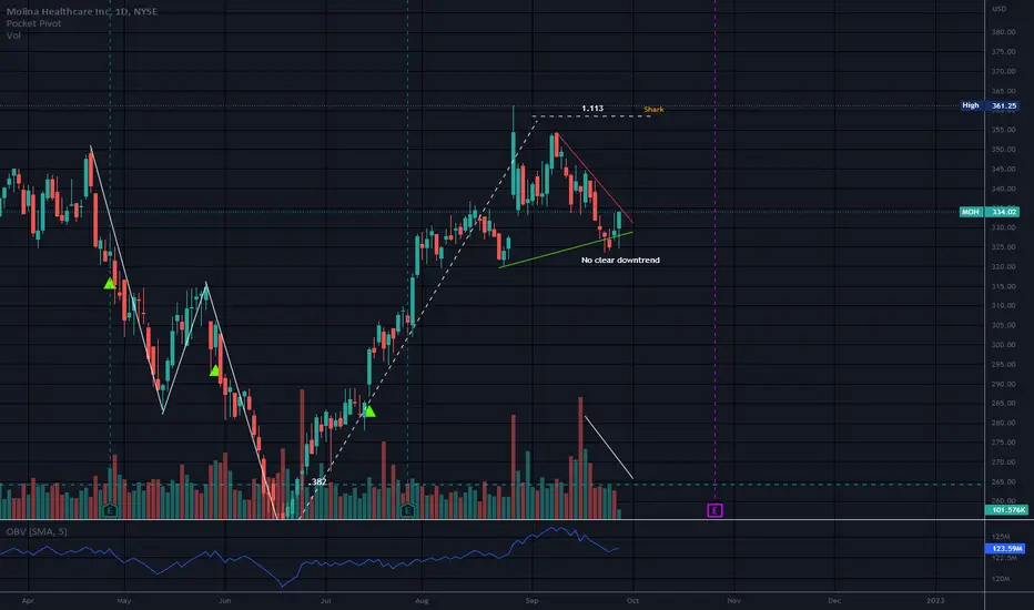
Symmetrical Triangle/PC Ratio Chart to Help with Market TimingThis triangle looked as if it would break to the downside. Now price is back inside the structure but a confirmed downtrend was never established.
This is an example of why it is important to wait for a confirmed downtrend or a confirmed uptrend after the break of a pattern.
Volume declining but this is not unusual in a triangle or a flag pattern.
I do think MOH will go down eventually, but it is almost impossible to know which way this triangle will break.
I learned something new about timing market rallies versus oversold status. The market was very oversold before this bounce so it was a bit obvious it was coming.
But this put/call ratio chart is something I will also look at in the future and I did not know it was on here. This is a Put/Call ratio chart and the ratio is over the bands.
Thank you for the info markrivest (o:
No recommendation
SMH/QQQ Ratio ChartMy Favorite Ratio Chart. Semiconductors are a leading indicator of the Tech sector.
Typically has a timely divergence with few false signals.
Best,
RH

Monthly Ratio Chart of Banknifty/Nifty:On Monthly chart, the Ratio of Banknifty/Nifty has been moving in upward trending channel since 2001.
In every correction the channel has acted as the support zone, as seen from the chart.
On previous occasions during the correction, the RSI indicator has held the levels of 35-40, which is said as support levels for Bull market corrections.
This time around the ratio is trading around the lower end of channel, but RSI is around the levels of 31.
If RSI fails to hold the levels of 35 on monthly closing basis then it is fair to say that we can have serious issues with this bull run of ratio chart.
For educational purpose.

VIX futures contango and backwardation - VIX/VXV ratio chartIf you trade VIX futures (and if you ever bought/sold UVXY you do) then contango and backwardation periods are important to monitor.
Several analysts over the years have suggested a .90 ratio of the VIX to VXV for detecting contango (under .90) and backwardation (over .90). That ratio chart is presented here with the UVXY/VIX in the background. Why UVXY/VIX? Because UVXY loses value relative to the VIX consistently due to contango. Pull up a 5 year chart of UVXY to see why contango makes it the worst hold there is.
On the whole the .90 rule works - you can see where the UVXY is rising in value relative to the VIX (backwardation) when above .90. This all makes sense - think of VXV as "the 93 day version of the VIX" (vixandmore.blogspot.com) and realize that backwardation happens when the distant future seems more certain than the immediate future. So when the VXV (as a denominator) shrinks relative to the VIX (the numerator) we have traders much less certain about the next 30 days than the next 90. Such periods are when UVXY builds value. The UVXY/VIX chart shows such periods to be brief.
EDIT: Just noticed that spikes below 0.80 also result in backwardation of UVXY. Now to figure out why.

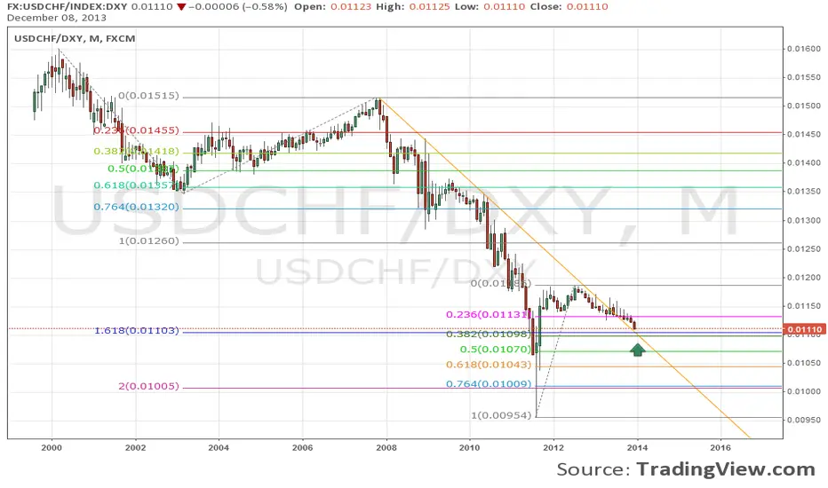
USDCHF vs. Dollar index ratio chart monthlyBig support for USDCHF on this ratio chart: trendline & fib ratios - but still has some space to fall.
BANNIFTY/NIFTY RATIO CHARTBANNIFTY/NIFTY RATIO CHART
Expect banknifty to outperform going forward, Ratio trading exactly near support levels @ 2.25, as marked by white ellipse.
Its only an observation & not any suggestion.

DXY/ZN Ratio Chart - USD Is Nearing Target Against 10Y US NotesThe longer-term trend and the cycle of the USD in a comparison with 10Y US notes ( DXY /ZN ratio chart). It can slow down later this year or in 2023, but if there will be recession, then USD can face another big leg up before an important shift occurs. GBP could stay weak in the meantime and it can even retest the 2020 lows first.
Be humble and trade smart!
All the best!

TFUEL / THETA Ratio Chart Anticipating A Breakout To The UpsideAnticipating a breakout on the TFUEL to THETA Ratio chart to the upside. Looks like TFUEL will eventually outperform THETA for a period of time once it breaks out of the range.

Copper vs Silver Ratio ChartWhen in a commodity bull market, a rotation occurs naturally between copper and silver.
The ratio chart shows you which one should out perform.
It's now silver's turn to shine bright!

ROUNDED TOP ON GOLD:SILVER RATIO CHARTROUND N' ROUND SHE GOES ...
A bearish rounded top is forming on the daily GOLD:SILVER RATIO chart ... possible outcome : drop to 71.29 support (March high) which is close to the 200-dma, a bounce to resistance trend line (black) & then a drop to lower trend line (blue)

Dollar gold ratio chartDollar has been strong recently. The dollar/gold ratio chart shows there is still no clear signal to long dollar at this point (comparing with owning GLD). Note the concerning MACD signal.

